Creating Graphs
Excel Visualizations
Basic charts can go a long way. Bar and pie charts, histograms, and scatter plots are very simple to make inside of Excel.
To create a visualization in Excel, you will first need to have your data in a spreadsheet format (rows and columns). List the names of your variables in the top row. Depending on the type of data you are working with, and the type of chart you want to make, you may have numbers of columns or types of variables. However, most of the time, you will want your data to follow these guidelines:
- The first column should be strictly categorical. Examples of categorical data include things like name, gender, place, ID, genre, or essentially anything that would be written as text. There can be multiple categorical variables in your data set.
- Any columns that do not have categorical variables need to be strictly quantitative (i.e. numerical).
- For most graphs, you will need at least one categorical and one quantitative variable.
- Note: If you are trying to paste data into a spreadsheet and it is not quite working, the “Get Data” button (under the data tab) could resolve the issue.
Highlight the data that you intend to use for your chart, and click on the Insert tab. There is a whole Charts section of this tab that will allow you to choose different types of graphs (ex. bar charts, line graphs, pie charts, etc.). Play around with these graphs, and choose one that best illustrates your data.
Once the chart has been made, right-click on the chart itself to format it. You can change the color, axis range, text labels, position of the title and key, range of data included in the graph, and more. If you have any questions about how to do this, Microsoft has a visual tutorial explaining the chart features.
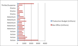
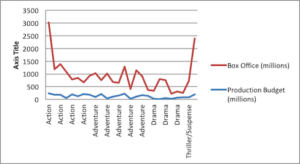
The images below demonstrate a chart and two types of graphs that can be generated from its data:
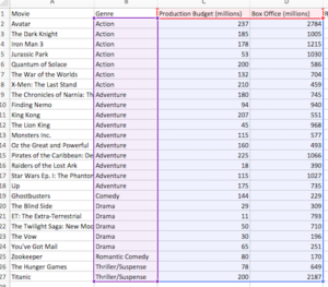
Above is a random data set pulled from RAWGraphs. The data is highlighted in different colors, indicating that different columns are being used for different parts of the chart: purple for categorical data, and blue for quantitative. The cells in red correspond to the key on the charts displayed below. Both of these charts are using the same data and showing the same result; one just may be easier to read than the other.
Excel charts are not a customizable as other options discussed further on. However, one very useful aspect of Excel charts is how easy they are to export. To export your chart:
- On a Mac: Right-click on the chart and select “To make an image.”
- On a PC: First, copy the chart, and then paste into Microsoft Word or PowerPoint. Make sure it pastes as a picture, using the “Ctrl” button that will pop up at the bottom right. You should then be able to right-click on the image and choose “Save as picture.”
Web Resources for Making Graphs
The following are web resources that will allow you to easily make graphs. Each of these has different features, but each allow you to paste or load data from your spreadsheets and turn it into attractive graphs.
Creating Visualizations in R (ggplot2)
A warning is needed before we go into details about RStudio and ggplot2.
This is a programming language!
Some basic knowledge about coding is needed to continue. BUT…we have you covered! Joey Stanley has great tutorials on R and ggplot2. They are very thorough and discuss (with pictures) how to install and add the correct packages, and they assume no prior knowledge. If these types of visuals are what you want, it is highly suggested that you take the time to at least read his tutorials. Here are more: another ggplot2 tutorial, and a ggplot2 cheat sheet.
The remainder of this section will assume a basic understanding of R and the ggplot2 package.
ggplot2 allows you to customize almost every aspect of the visualization by giving you the control to change more than just the color. You can add layers of different types of charts, color code the data points to illustrate particular interactions, and change the shape of the data points. Joey’s handout covers the different visualizations and how to make some specific changes to the chart, so to prevent redundancy, this tutorial will focus on the different, yet necessary, components to create an elegant and illustrative visualization.
The following code is an example of what a ggplot2 line of code looks like, and the graph below illustrates the output when this code is run. This data comes from the same RAWGraphs dataset presented above, but this time in scatterplot format.
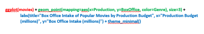
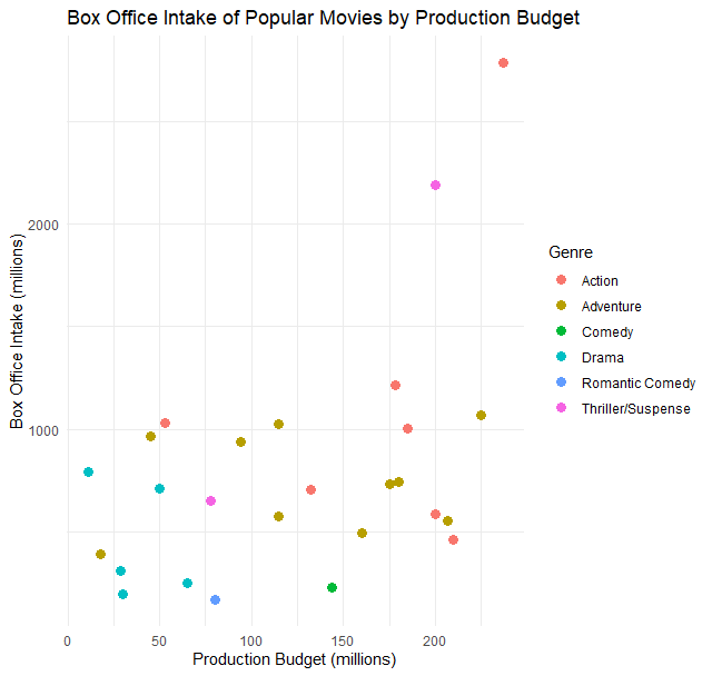
There are three different components to using ggplot2: Data (in red), Geom (in green), and Labels and Themes (in blue). The data component only calls for a few steps: you just need to save your data into a variable. So, for example, you could run this line of code:
data <- read.csv(file.choose())
and then select your data file. This will take your CSV file and save it into a variable called “data”, which you can reference later on as you create your graph. In the example above, a CSV file was saved to a variable called “movies.”
The geom component is the most important attribute to the visualization, and tells what type of shape you want to place on your graph (i.e. a point, a bar, etc.) For a scatterplot like the one shown above, you would use “geom_point()”. It is possible to add two geoms to the same plot: just add another “geom_point()” (or other shape) to the line of code!
Inside the geom function, you will name the variables you want to use. Ideally, you will want to use a categorical variable as your “x” variable and a quantitative variable as your “y”. If you decide to compare two or more variables in your plot, you can color the points by a different variable. In this example, this is done by “color=GENDER”, which makes the dots different colors and places a legend on the side. If you are only testing one variable, either leave the color attribute out of the code, or put in the name of the color (e.g. color=”blue”). (As you can see, coloring the dots is crucial to the data above: if all the dots were the same color, you wouldn’t be able to tell a difference between the NO and YES columns. With color, however, you can see that when a married woman has no children under 6, she is likely to work a greater number of hours per week.) There are plenty of these examples in Joey’s tutorial (linked above), if you need more guidance about this aspect!
Next, the labels and theme component allows you to format your graph by adding axis labels and using predefined themes to make the design smoother. By default, ggplot2 names the axes by the variable (column) name. Being able to change the name allows you to tweak this label in order to help readers understand the chart, such as by adding units. For a guide to ggplot2 themes, see the cheat sheet linked above.
Last, you can save your graph to your computer by clicking the Export button in RStudio, which you can find above where the graph is displayed. Once it is exported, it is a typical PNG file.
There are plenty of other resources for R and ggplot2, starting with the tutorials above! However, this should help with the first step: knowing how the different functions affect the chart and what parameters are needed. Good luck!
Creating Visualizations in Tableau
Tableau is a visualization-creating program that is very popular in the business world due to its ability to create attractive graphs, handle huge amounts of data, and directly share images online. While many of its most powerful features require a subscription, Tableau Public is free to use and is more than capable of handling humanities research data. The following tutorial provides instructions about how to install Tableau, import files, and generate a bar graph. You can also find official Tableau tutorials here (in video form).
Note: All of the basic Tableau chart types can be created in Excel, and R provides an even wider range of visualizations. Tableau has a bit of a steep initial learning curve, so if you are already familiar with Excel or R, you should have no trouble getting the visualization you want using these programs!