Network Graphs
What is Network Analysis?
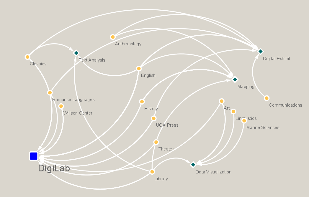
Networks are composed of 2 elements, nodes and edges. Nodes represent the objects of interest, while the edges represent the connection between them. Nodes can be of the same or different category within a network graph. With that said, a network can show relationships between people, while at the same time networks can show connections between pieces of literature with their author, an influence, and/or the content between the pieces themselves. Accordingly, the edge connecting the two nodes together represents how that specific connection is made. Networks can be thought of as a map of relationships. The purpose is to study the path, a collection of edges, that connect the two distant nodes, and to discover other paths that were not so obvious before. Caleb Crumley has composed a tutorial for the DigiLab that breaks down some theorems to show the capabilities of Network Analysis and how it applies to Digital Humanities.
Centrality
Centrality can be really important to look at in network analysis, especially for humanists. There are different dimensions of centrality, but the one talked about the most is betweenness centrality. What this term measures are the shortest paths between the nodes. For example, let us say we have a network of people and we are recording their interactions by the type of relationships they have with each other. So imagine a bit of information that we follow through the network. If we try to map the distance of this information, how fast does it get to everyone? Betweenness centrality measures how much influence a particular point has on the network, based on how quickly information can flow from that point to the rest of the network.
You might be wondering if this isn’t the same thing as counting all of the edges that are connected to a particular point (a measure known as degree centrality). Well, that has something to do with it, but different edges might have more centrality “power”. Specifically, if one person or node has an edge that leads to a cluster of nodes, then this connection is weighted heavier than an edge that only connects to one other person. Knowing this, it can be good to have the nodes sized by betweenness centrality. This option will be discussed as it becomes available.
How should your data be structured?
The DigiLab has created a two-part template for Network Analysis, and this page will discuss how to use that template according to each programs’ needs. Download the two necessary csv files here: Nodes and Edges. You will need both sheets for your own records, but some visualization programs will not need as much information.
The nodes csv, as its name suggests, will contain all of the information about your nodes. If your network is about the connections and relationships between different people, then the nodes csv will have all of the information about these people. At a minimum, the columns ID and Label are required; the others will depend on what information is relevant to your study, but it is recommended to keep as much information as possible stored in the csv!
The edges csv contains the relationship between each pair of connected nodes. This is done by providing a source and a target. If the visualization method you are using only requires an edges file, then the source and target can be the names of two people who are connected. If you are using a nodes file, then the source and target need to be the IDs from the nodes csv.
In addition to source and target, each interaction should also be labeled for weight. The weight cell will contain a numerical value that represents a type of relationship, such as spouse, friend, acquaintance, etc. The number itself is not necessarily important, just as long as you are consistent with the ID numbers and their weights. (In other words, if friend=1 and spouse=2, that doesn’t mean that a spouse is a stronger relationship than a friend. Weight numbers work more like IDs for the relationship type.)
It is important to note that “source” and “target” indicate a directional relationship. For example, imagine that 101 is the source and 201 is the target. A directional relationship would mean that 101 is a friend of 201, but 201 is not necessarily a friend of 101; to express a reciprocal friendship, you would need a new entry with 201 as the source and 101 as the target. This is especially important if the type of relationship is different depending on the direction: for instance, if 101 sees 201 as a mentor, but 201 sees 101 as a rival, then specifying both 101 à 201 and 201 à 101 (and their respective weights) is important.
To recap, the nodes sheet requires (at a minimum) complete ID and Labels columns. The edges csv requires Source, Target, and Weight. The provided spreadsheets should have examples of what typical data for the nodes would look like, and what is needed for the edges; there is “wiggle room” with the nodes sheet but not so much with the edges. The best way to approach this page is to skim through and see which program might best suit your needs and skills. The read which columns you need and how picky that particular program is BEFORE you start collecting data.
Let’s Start Off Simple
The programs listed in this section will be internet tools that are good for quick graph building. Their pros and cons will be discussed below.
Palladio is a tool created by the Humanities and Design team at Stanford University. Once you click start, the page will ask you to upload/paste your data. For Palladio, the only data needed is the target and source data from the edges sheet. Palladio is not picky with your input but it needs to be able to identify the source and target from it. When making the graph, it is easiest to read the network when the names (i.e. the Labels column) appear instead of the IDs. That is your preference, but Palladio only needs those two columns to create the graph so it will label the nodes depending on the data uploaded. So for example, if you wanted to have the IDs on the network, then upload the two columns for source and target that have their ID numbers instead of their names. Vice versa to have their names pasted. Once the data is uploaded, Palladio will draw your attention to the variables that could pose issues because of special characters by displaying a red dot beside them. You can resolve this by clicking on each character under “Verify special characters”, which will preserve them in your data. (To cut down on the number of times you need to do this, it might be easier to just copy the two columns you need and paste them into the box, instead of having everything else from the edges csv.) Once this is done, click on the “Graph” tab on the top of the screen to create your network. Choose the variables you want to be your source and your target, and you should see the network graph appear. Finally, you can choose to size nodes according to their number of edges.
Connect The Dots provides more useful data about the nodes whereas Palladio can provide better visuals. Connect The Dots needs the exact same data that Palladio needs, but is not as flexible with the upload as Palladio is. Connect The Dots wants ONLY the source and target columns in their own sheet. So if push comes to shove, you may need to copy and paste just those two columns into a separate file to upload into Connect The Dots if you have more than source and target columns in your original spreadsheet. When it comes to graph labels, the same rule applies to this tool as it did with Palladio. If you want the names to be displayed instead of the ID numbers, upload the names instead. The output between the two tools is slightly different too. If you play around with Connect The Dots network graph, you will see there are some functional ties to it, meaning there are some additional features when you run your cursor over a specific node. Palladio does not compute the degree and centrality of each node, but their graph is more interactive. Palladio will let you size by the number, which is nice, but does not have as much meaning as when we size in the programs further on. So each program is good, but some excel in different areas. If you decide to go with either of these programs keeping up with the IDs is not necessary. It will be necessary later on, but in order to create the graph, the input needed to create the graph will suffice. IDs are usually recorded because they are less likely to cause any error with the data collection. These programs are case sensitive, meaning “DigiLab”≠”Digilab”≠”Digi Lab.” Whichever you choose, be aware of the places for error and be diligent to prevent them.
Both of these export as a typical picture in SVG format. This will do the job depending on how you plan to embed this network but the programs discussed later on will allow for more options to export. Palladio itself can do more than just networks just like Data Basic can do more than just Connect The Dots. These programs are great and very useful for quick network building. There is hardly any customization with these, and it is hard to make a program that can customize as you please and keep the interface very simple. So as we move on to other programs, keep in mind that these will not be as easy. Not to scare you off, but to just to point out that with more power in the hands of the user, the more difficult certain functions can get.
Let’s Increase the Difficulty
Cytoscape
The programs discussed in this section will require a few more steps, but the customization control is worth it. These programs are the reason the csv is structured in a particular way. They also require more data. The spreadsheets are linked here again for convenience: Nodes and Edges. These programs will allow you to customize the network and to do some deeper analysis.
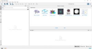
Cytoscape is an open source software that is predominately used for bioinformatics. On this website you can also download plugins through their app store. We will be discussing the upload, customizations, and export of the network. If you desire further knowledge, then Cytoscape’s tutorial and manual are a recommended starting point. First you will need to download. Note that you will need to have Java Runtime Environment installed on your computer before Cytoscape will install; if you do not, you will be prompted to download it. Once you have completed the installation and opened Cytoscape, you will see a screen like the one below:
The easiest way to upload your file will be to drag to the box that says “drag network files here” on the left. Once it is uploaded, a window like the one below will appear, where you will assign each column to a particular “meaning.” As in the picture below, this drop down menu will appear for each column. The point of this step is to tell Cytoscape what type of data each column contains.
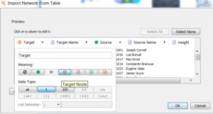
The edges spreadsheet for Cytoscape is very similar to what is needed for Palladio and Connect the Dots. It is necessary to discuss the slight differences now, so it will make sense on how to match the “meanings” for each column once it is uploaded into Cytoscape. The edges sheet is structured particularly for this program. This is the only program where the interaction column, or relationship, needs to be defined in words, not a quantitative value. The other programs mentioned on this page do not need the interaction column. The interaction column is the word associated with that particular weight. So for example, if you give a weight of 1 to represent a friend, 1 would be in the weight column while “friend” would be in the interaction column. After dragging your data into Cytoscape, it will ask you to verify that Cytoscape has labeled your columns correctly, illustrated above. What is meant by that is, Cytoscape reads the column headers in your csv, and it tries to match up the “meanings” it needs. It knows though that it can be wrong sometimes depending on the column header, thus it gives you the opportunity to confirm and or correct its assumptions. Based on the edges sheet that the DigiLab has provided, this table below will tell you how to match them up. It is recommended that you at least structure your edges sheet similar to our template because Cytoscape only needs a max of 6 “meanings.” The first column will be your spreadsheet columns and the right will be the corresponding “meaning.” If you have more in this file, it will display all columns but there can only be one Source, Target, and Interaction. The rest will have to be some attribute or not imported. Cytoscape specifically does not require IDs, so the Source and Target columns will be classified as the “Not Imported” meaning. The way you know which meaning icon is which, just hover the cursor over the icon and the name should pop up. This is also illustrated in the picture above as well.
| Headers in the edges template | → | Corresponding Cytoscape “meaning” |
|---|---|---|
| Target | → | Not Imported |
| Target Name | → | Target |
| Source | → | Not Imported |
| Source Name | → | Source |
| Weight | → | Edge Attribute |
| Interaction | → | Interaction Type |
Once all of the meanings are assigned, Cytoscape will build the network. It will be a generic looking network to start with. The next step will to customize. So the first step is to analyze the network. At the top of cytoscape, go to Tools → Analyze Network and check the box to treat network as directed. Now that we have the network data, we can use it to customize our network before it is exported. This may open up a separate window or a different section on your current window of Cytoscape. This can be predominantly ignored for we are only concerned with customizing and most of that data would be useful for bioinformatics networks. On the control panel there are going to be 4 steps to sizing the nodes by centrality. The steps are displayed below:
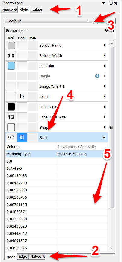
- To customize your network, the style tab on the far left must be selected.
- Since we are trying to size the nodes, make sure you are on the nodes tab at the bottom. Here is where you can also color the nodes and customize other features as well.
- Next, this drop-down menu is for certain styles. Play around and figure out which one suits you the best.
- Click on the arrow next to size. Set Column to betweenness centrality and Mapping Type to discrete mapping to assign each centrality its own size. You could also choose continuous as your mapping and cytoscape will proportion the sides of the nodes to the best it can. Sometimes the leaf nodes (the ones usually with 0 centrality) might be too small. In that case discrete is the way to go so you can control the difference in sizes.
- If you decided to choose discrete mapping, then here is where you will insert the sizes (in the box to the right of each value). 10 is a good starting spot for the 0s. From there try to scale according to the difference in centrality. It is needed to know that if the difference is small between two different centralities, it might not be necessary to treat them as a different centrality. Completely up to you, just play around with them and see what looks the best for your graph.
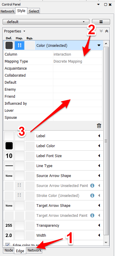
For coloring the edges by interaction type:
- Make sure you are on the edges tab.
- Select Color or Stroke Color. Choose “interaction” and “discrete mapping.”
- For each interaction type, select the color you want for the edge.
Now that your network is scaled and colored, it is easier to see just by looking at the network who is connected to more clusters than leaf nodes (betweenness centrality) and the different relationships between the nodes. Remember it is one-directional, so just because there is a friend edge between two nodes, that does not mean that both consider each other friends. There could be two separate edges connecting to two nodes. They could be the same color or different, either could be expected. Now depending on your network, cytoscape might have clustered it together or not. Once you are finished customizing the design, all that is needed to spread the network out is to locate the layout button on the top menu. From there, there are some different layouts that cytoscape offers, but the best for these types of projects will be Apply preferred layout in the layout menu.
Exporting from cytoscape can go two different ways. First, it can export as a normal picture file. If you do this step, then make sure that the entire network is viewable in the window before clicking on these buttons File → Export as Image. Cytoscape can also export the network as a webpage File → Export as a webpage and make sure you have the simple viewer for current layout before you select OK on the export popup window. What this provides is a zip file that will need to be extracted. Once it is extracted, it is your basic html layout and easily embeddable into your webpage.
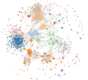
The image below illustrates the type of visual that you can generate in Cytoscape. For another example of network analysis in action, you can also check out Mina Loy’s social network!